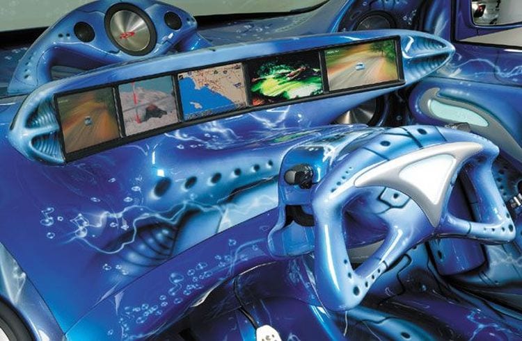
On every car show there is a corner dedicated to the car interior design. For the most part, one can see tastefully done interiors, with matching colors and functional details, which are quite pleasant to look at. Then there are the other kinds of interiors, the ones featured on this list. Some of the designs listed below are merely impractical, but most of them are downright awful and present an eyesore. Seriously, staring at some of these too long may actually cause you seizures. Continue reading at your own peril.
24.
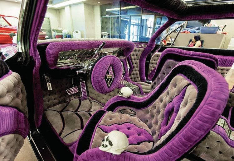
The theme here seems to center around pink and skulls, as if Dracula had a teenage daughter and wanted to gift her this car for her sweet 16th birthday.
23.
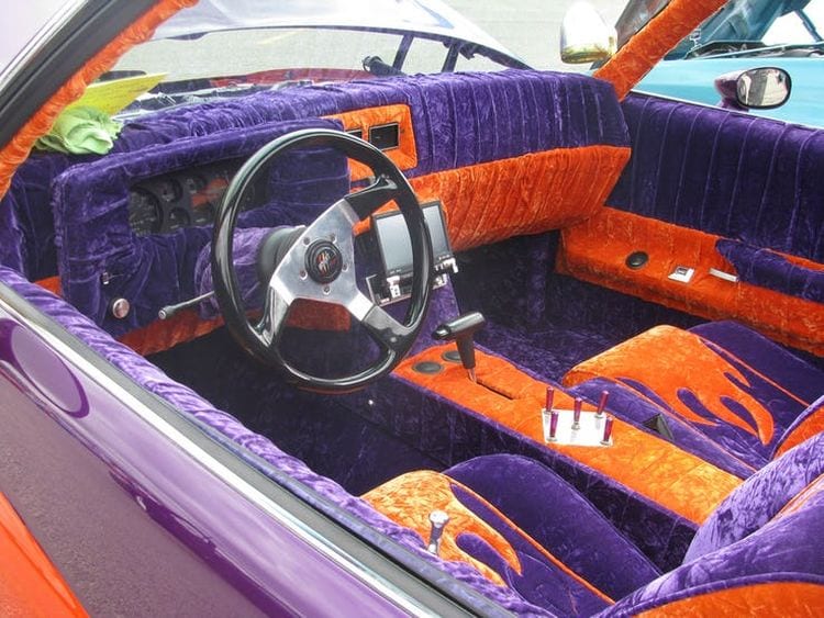
Orange and purple seem to be a popular combination, especially if all orange bits are done in a form of flames.
22.
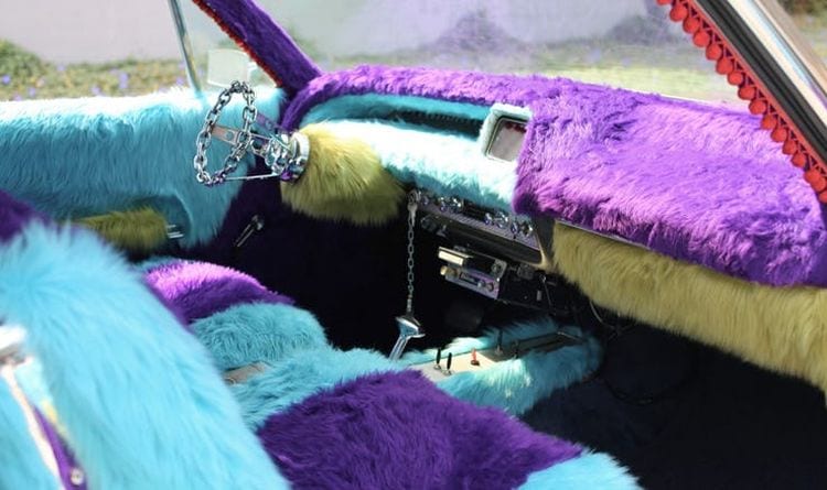
This car looks as if someone skinned Sully from Monsters Inc. And used his fur to upholster the whole interior.
21.
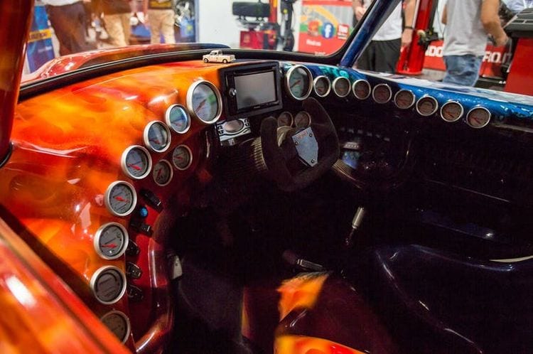
Having all important information about your car at a glance is all well and good, but with all these dials, plus a huge central screen, how do you find time to pay attention to the road and traffic around you?
20.
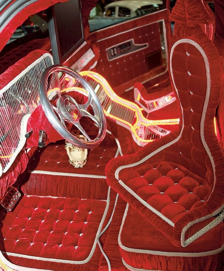
We can really see the point of this car. I mean, velvet floors? Really? And those seats, despite being able to rotate, look anything but comfortable.
19.
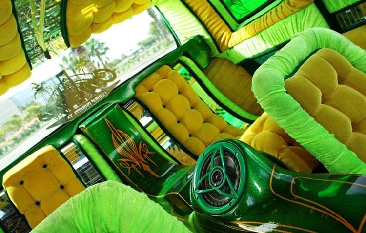
Can a car interior be too green? Apparently, the answer is resoundingly yes. Also, too gaudy as well, but we at least knew that existed as a possibility.
18.
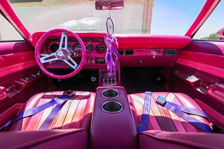
The all-pink Ford Thunderbird is a sort of a classic, but this may be taking it too far. Pink leather on the seats, pink steering wheel, and, for some reason, pink dream catcher, the interior feels a bit forced.
17.
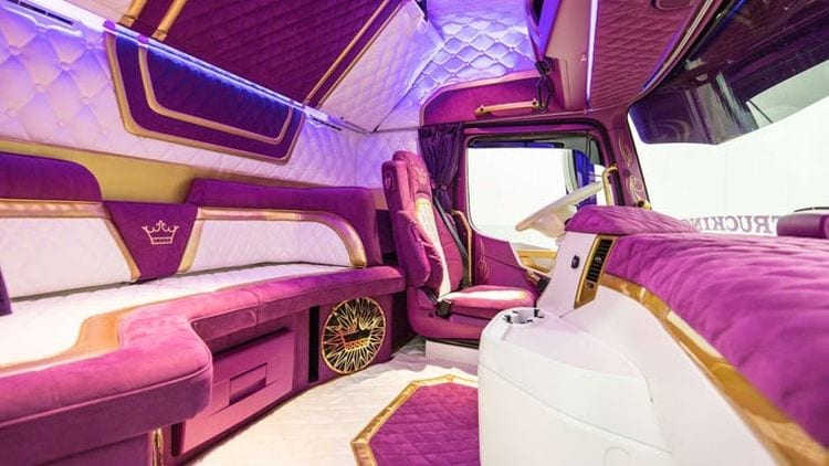
This is obviously a showroom semi, because no trucker worth their slat would be caught dead inside this suede nightmare. Plus, a white steering wheel? For a truck?
16.
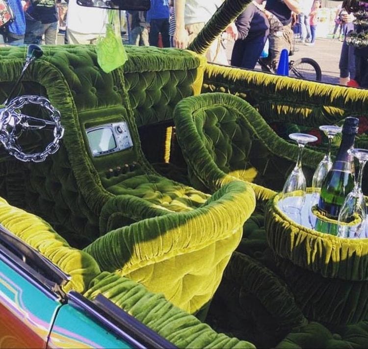
Green velvet and champagne aren’t the first things to come to mind when one thinks about a car interior, yet here we are.
15.
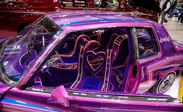
A Japanese take on a classic American low rider, this car has an interior featuring pieces of mirrors slapped to every possible surface and a gear shift handle made out of beer tap handle.
14.
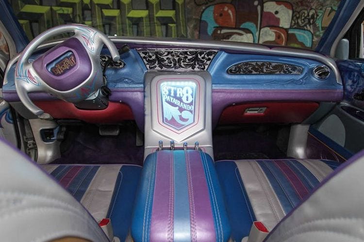
Retro look combine with SF elements, but done in a very distasteful manner.
13.
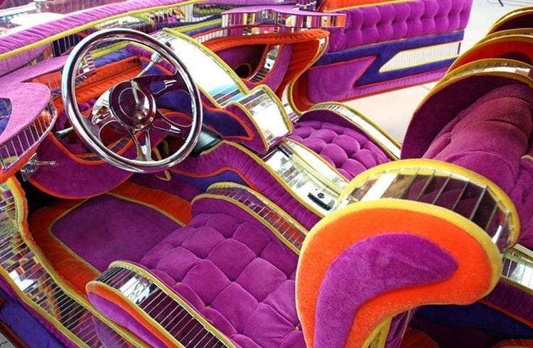
Again orange and purple, but this time mixed with dozens of mirrors. No visible dials and not even a gas and brake pedals makes us wonder how is this supposed to be driven.
12.
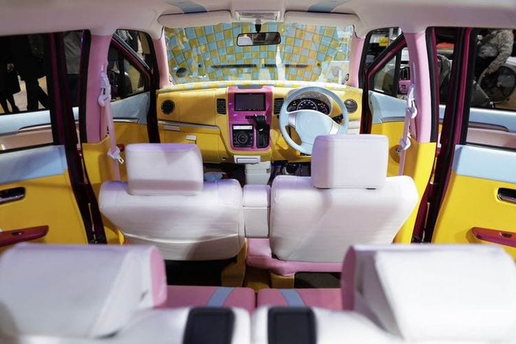
This interior looks like it was designed by a color-blind person. Pale pink paired with yellow and purple details, simply awful.
11.
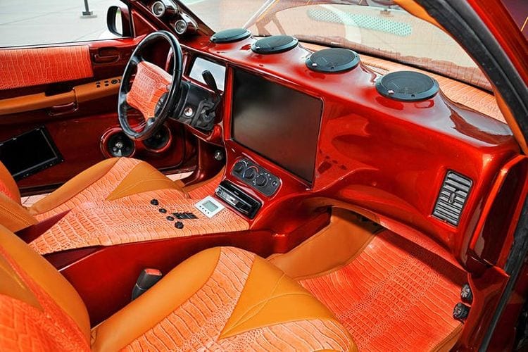
If you can afford to use floor mats made of animal skins and put a TV-size screen on a center console, you should be rich enough to hire a decent designer.
10.
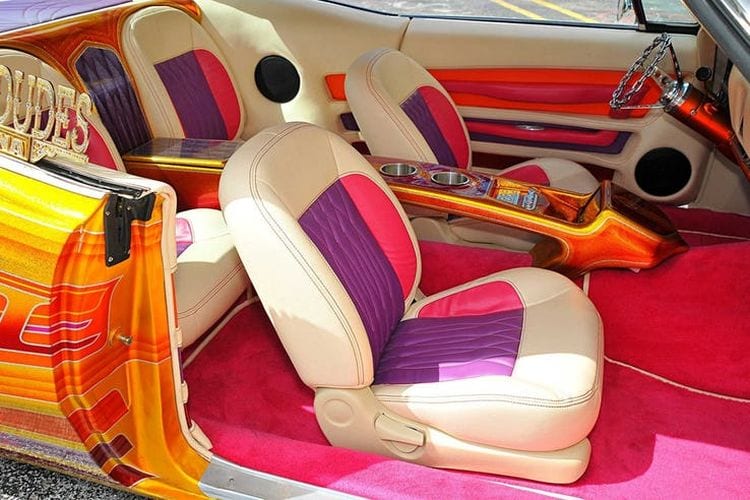
If you ignore the orange paint job on the car, this interior looks almost nice, with the exception of a chain steering wheel. Imagine gripping that thing every day during your rush hour commute.
9.
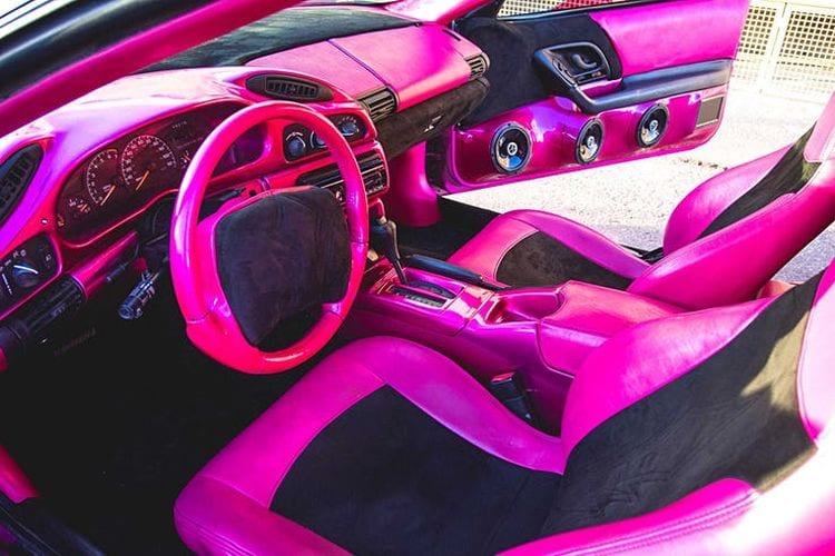
Why would anyone want to do this do a Camaro is beyond me. Pink and black leather and enough speakers to power a small concert venue?
8.
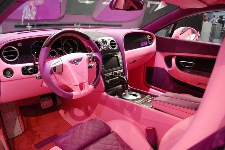
This would happen if Barbie has won a lottery and bought a Bentley.
7.
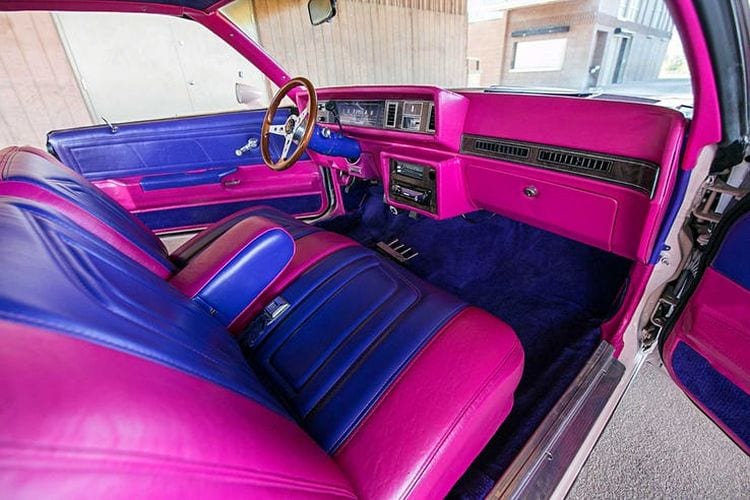
Dark blue and purple, with a wooden steering wheel, in a classic car painted in bright pink doesn’t really sounds like a recipe for a good design. At least you can use the steering wheel on this one.
6.
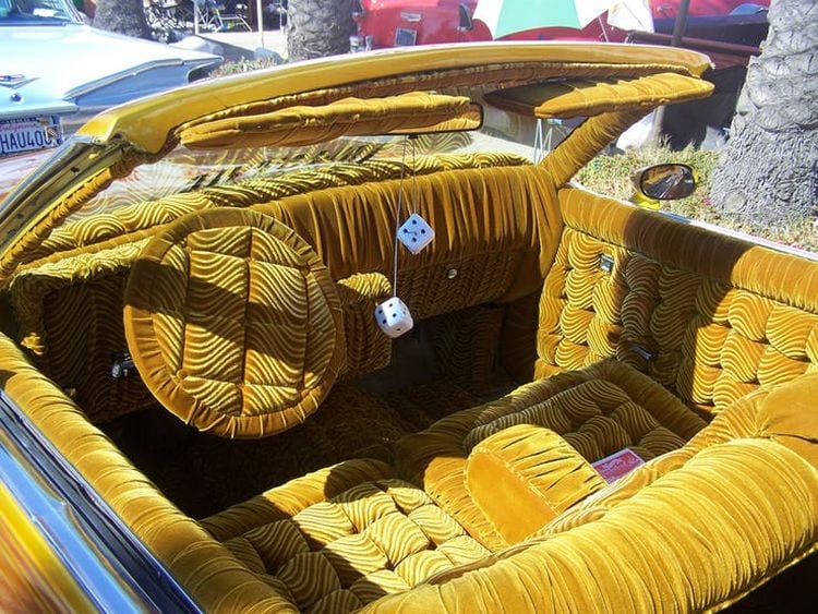
Probably intended as a color of gold, the interior of this car is more color of puke. Or diarrhea, for that matter.
5.
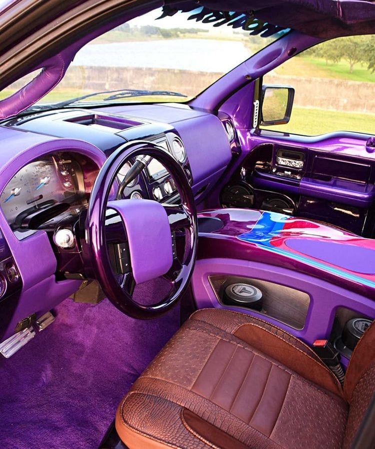
This one doesn’t make much sense, but then again, so do many of the interiors on this list. Bright purple combined with old leather seats looks like the owner ran out of money half way trough redesign.
4.
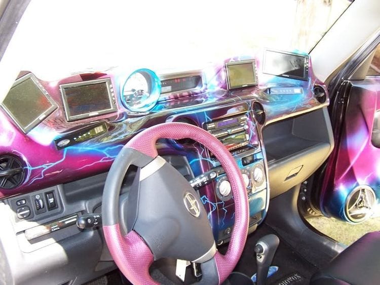
There should be a law against interior designs like this one and we are not talking about the color either. It is pretty much impossible to see the road from all those screens blocking a driver’s view.
3.
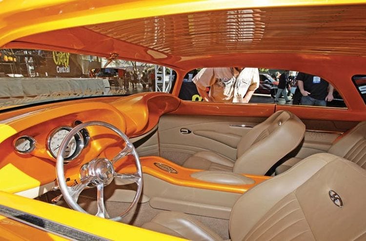
This interior was shown on SEMA, proving that even one of the world’s vest car shows isn’t immune to bad taste.
2.
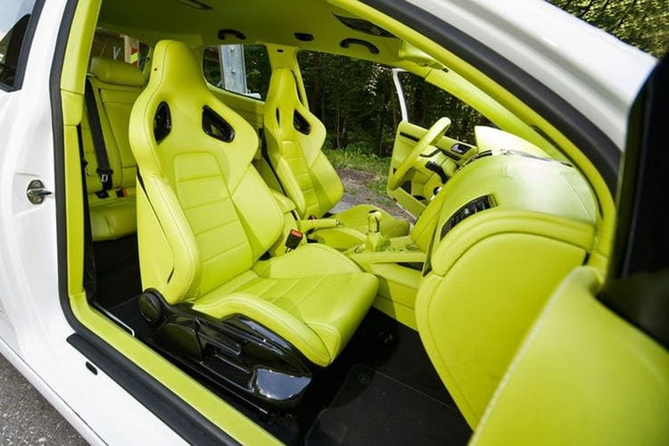
As far as colors go, this one isn’t the worst choice we have seen, but bright green interior like this one would be a nightmare to keep clean.
1.
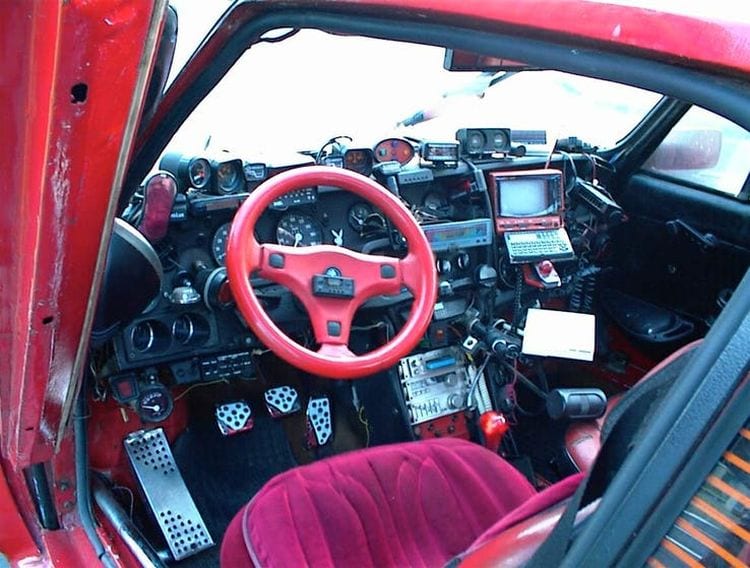
We are not sure why would anyone do this and for what purpose. It is impossible to fathom what info all these dials and gizmos display, but if even half of them are functional, driver would be hard-pressed to keep an eye on them and on the road at the same time.

