
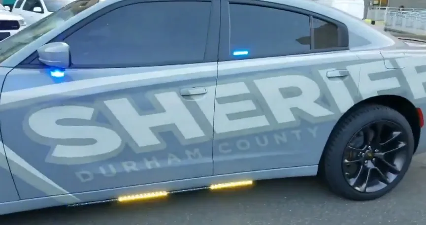
Would a driver a block away notice the patrol car behind them, or only realize it was there after they’d already rolled through the stop sign? That question sits at the center of a real debate inside police departments right now: subdued, low-contrast “ghost graphics” versus a design that’s meant to be seen from a distance.
Both approaches have a following. Here’s what each one actually offers, what tends to get left out of the conversation, and how a department can weigh the decision with a clear head instead of just following a trend.
Where Ghost Graphics Came From
It wasn’t that long ago that ghost graphics were relatively uncommon. Over the past decade, though, they’ve become a familiar sight on patrol vehicles. The subdued look appealed to departments that wanted something less flashy than traditional graphics, and some also liked the idea of making enforcement vehicles a little less conspicuous. Once the trend took off, it spread quickly.
What Are Ghost Graphics?
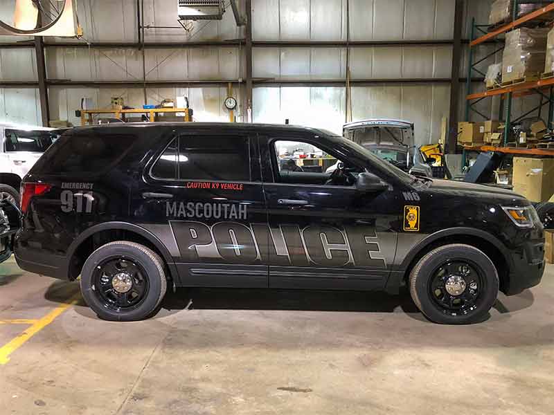
Ghost graphics for police cars use tone-on-tone designs, usually a dark badge or unit number printed in a slightly different shade of the same vehicle’s base color. From a few feet away, the markings show up clearly. From across a parking lot, the car looks practically plain.
Departments that choose this look often point to a few reasons for doing so.
Among them:
- It gives the car a sharper, more serious appearance
- It can make a stationary patrol car harder to spot from a distance, which some departments use for speed enforcement
- Officers often like how it looks on camera and in photos
Those are genuine reasons, and no one should pretend they don’t matter to a department’s image or to officer morale.
What Gets Traded Away
Low-visibility graphics come with a cost that’s easy to overlook until it shows up in an incident report.
A patrol car parked on the shoulder at night, there for a traffic stop or a crash, needs to be seen by every driver who approaches that stretch of road. A subdued paint scheme with no reflective definition asks a lot of a tired or distracted driver watching for a car that blends into the dark.
Officers who stand outside their vehicles are exposed the whole time that vehicle sits on the roadside. A car that’s easy to miss puts the person next to it at more risk, plain and simple. Roadside strikes are a leading cause of line-of-duty deaths for officers working traffic stops, and visibility is one of the few variables a department can control before an incident happens, rather than after.
Some departments have also questioned what ghost graphics mean for public visibility. A traditional patrol car is easy to recognize from a distance, which can reassure residents and discourage unwanted behavior simply through its presence. A ghost-marked vehicle is much less noticeable, and that’s a trade-off every department has to weigh.
What Does the Research Say About Vehicle Visibility?
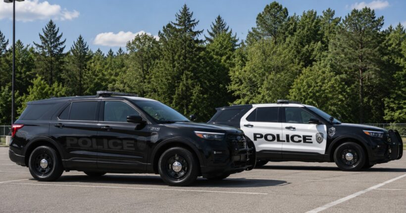
A team of vision researchers ran a study published in Scientific Reports in 2025 that speaks to this, even though patrol cars weren’t the subject. Drivers ranging from their late teens to their eighties, some with normal vision and some with diagnosed eye conditions, watched real video clips of night roads with built-in hazards: other cars, cyclists, and pedestrians.
Researchers timed how fast each person spotted the hazard, then compared that against a lab test measuring how small a movement a person could detect.
The drivers who struggled to pick up small motion cues were also the ones who took longer to spot hazards in the footage, even after adjusting for age and standard vision test scores. The effect was strongest for pedestrians, and the researchers pointed to a likely reason: the hardest hazards to catch on a night road tend to be low-contrast to begin with, a person in dark, non-reflective clothing standing still at the edge of a poorly lit scene.
That’s worth sitting with for a patrol car. A dark, low-contrast vehicle parked at the edge of a night scene asks a driver’s eye to do the same kind of work as picking a still pedestrian out of the dark, and the research says plenty of drivers are slower at that than we’d like to assume.
The same body of research points to a consistent fix. Retroreflective material on an object at night helps a driver’s eye pick it up and recognize it faster, well beyond what extra brightness alone would explain, because it gives the visual system a sharper motion and edge signal to lock onto. That’s a key part of why reflective strips on road workers and pedestrians cut down on recognition problems so reliably.
None of this means every subdued design is unsafe. However, what it does suggest is that the visibility question needs an answer beyond “it looks good in daylight photos.” When contrast gets trimmed out of a design for the sake of a look, it removes the exact cue a driver’s brain needs to register that something is there in time to slow down, especially on a dark two-lane road in the rain.
What About a Middle Ground?
A department doesn’t have to sacrifice visibility to get a modern-looking patrol car.
There are plenty of ways to add reflective elements without overwhelming the design. A lower-body contrast panel, reflective accents around the badge, or subtle two-tone graphics can make a cruiser much easier to spot after dark while still looking understated during the day. Some fleets even use tone-on-tone reflective vinyl that’s almost invisible until headlights hit it.
The priority should be visibility where it counts. The sides and rear of the vehicle need enough reflective material to stand out when drivers approach at night.
Too often, that step gets overlooked. Designs are approved from daytime renderings, departments copy another agency’s graphics package without knowing how reflective it really is, and the people who spend the most time standing beside those vehicles aren’t asked for their input.
Questions Worth Asking Before You Redesign Your Fleet
If your department is weighing a livery change, a few questions are worth putting on the table early.
Here’s a quick list:
- How does this design look under headlights at night, not just in daylight photos?
- Where does reflective material sit on the car, and does it cover the angles a driver approaches from?
- What do the officers who’ll stand next to this car on a highway shoulder think about its visibility?
- Has the department tested a sample vehicle at night before committing to a fleet-wide rollout?
The Takeaway
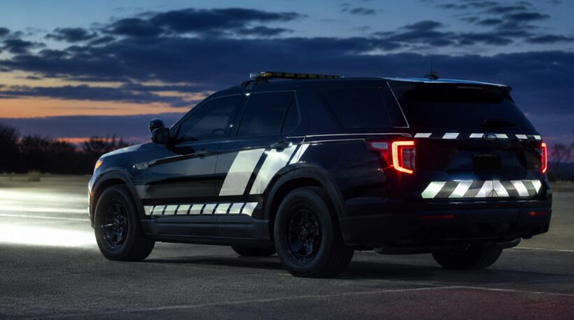
A livery decision shapes how a department looks and how safely its officers work for years to come.
There’s nothing wrong with wanting a patrol car that looks sharp and modern. The mistake is treating that as the only design goal and leaving visibility for later. A department that tests a design at night, asks its officers for input, and works with a graphics team that understands reflective material gets a car that looks the part in daylight photos and still does its job after dark.
It’s worth spending as much time on the visibility question as on the look itself. To make sure you’re answering these questions correctly and covering every base in the process, make sure you’re working with the most trusted names in graphic designs for law enforcement vehicles.
